Tuesday, December 29, 2015

Midday, late November

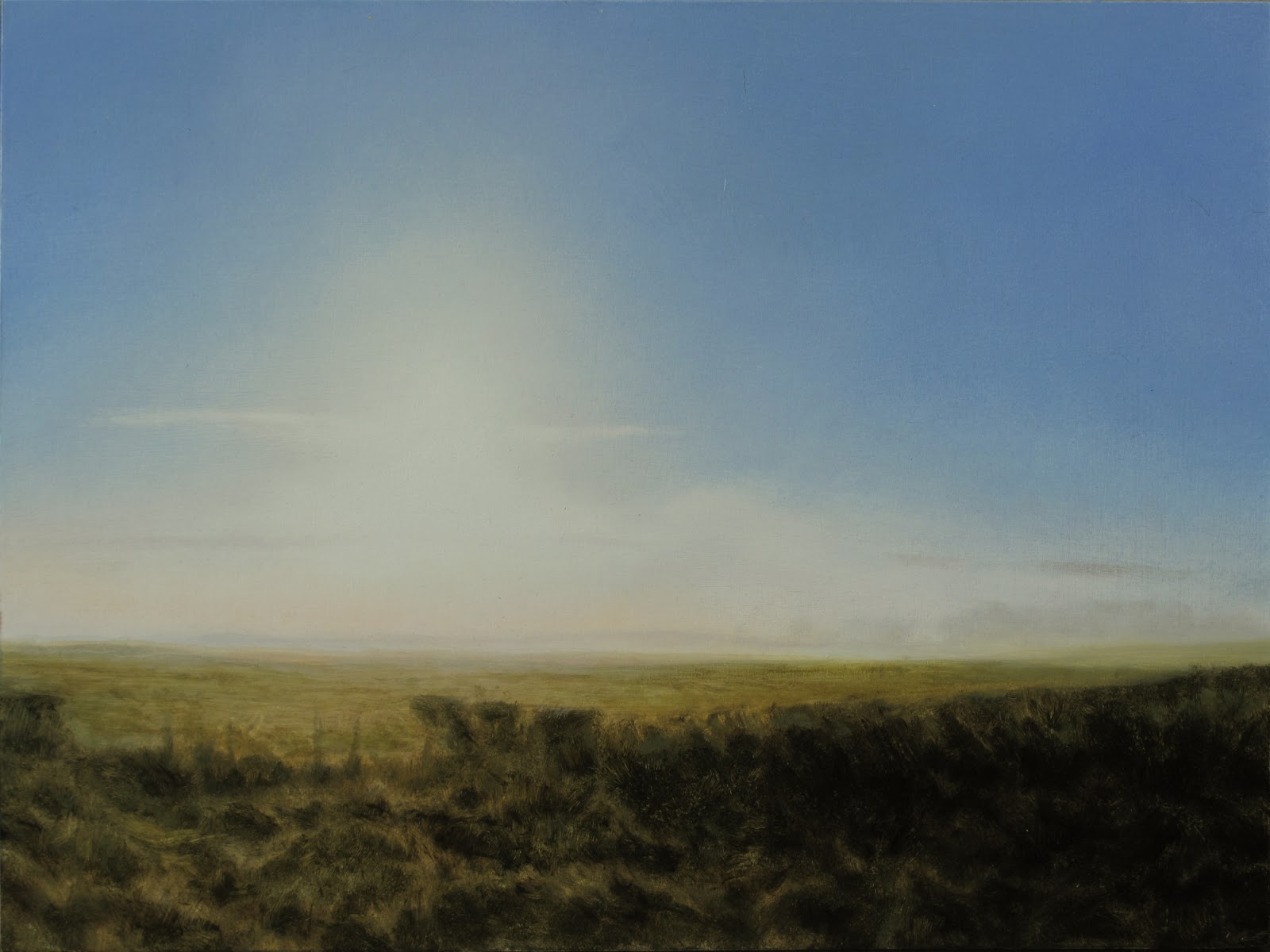
oil on card 30x18.5cm

Another year, another Cloud Study - and just in time. It’s more or less based on a photo snapped out of the train window on one of my usual jaunts to Perthshire. It’s midday (11.58am to be precise) on the 24th November and the Sun is at its zenith – so quite low.

(Before I forget, a quick news bulletin. I have two pieces - Bad Valley and Runner - showing in the SSA at the moment. That’s the Society of Scottish Artists Open show at the RSA Gallery on the Mound/Princes Street in Edinburgh. It’s free, and is open till 18th January 2016. 236 artworks were chosen from a total of 1254 entries, so quite chuffed. Back to the blog…)

It’s all about the clouds really. I thought there was a bit of structure going on where the three nearer, stringy clouds were floating in front of the larger, more diffuse masses behind. I didn’t pay any attention to the passing landscape at all – I was just waiting for the next gap in the trees to catch the sky through. I’ve used the ground and trees the photo gave me as a starting point, and treated them quite loosely. 

Technically, I’ve done the sky like a watercolour – it’s mostly straight oily glazes (with a little white in them) stippled with a soft brush onto the white priming. The cloud shapes and edges were refined where necessary by wiping the priming layer clear with oily paper towel or brush - as if I was wiping wet watercolour wash off wet paper. The paint was then carefully stroked and softened even more with a soft fan brush. The ground forms are lean turpentiney paint applied with hog brushes onto the oil-wiped smooth priming. The ragged marks were left crunchy. They were built up a bit subsequently, with slightly more opaque paint, but not too much. I quite like how the paint quality of the Sky/Earth elements is different, and this seems to be quite an efficient way of painting – certainly at this tiny size.

I did feel that a figure was necessary though, and went as far as sourcing a waving* young woman, and working her into the photoshop composition. However, on this size of work, she would have been tiny – about 1cm high including her waving arm – and completely impractical to paint. Just so you know, she would have been standing in front of the nearest bushes on the left, below the gap between the between the two higher birch trees. 

So, that’s all for 2015. It’s been a bit fractured what with one thing and another, but I do feel that I’m making progress, especially on the technical side. All things being well, I’d like next year’s work to be a bit more efficient, and I’ll see how that goes. There is One Thing that I know I should be doing though, and that’s much more Drawing. Of anything, anywhere, just drawing. And I think that probably applies to most of us.

Anyway, 2015’s just about over - have a good 2016…


* When I was very young, in London, we always used to wave at the trains, and the drivers and passengers would often wave back. It was rather nice. A waving figure seemed apt seeing as how this is a view from the 11.09 from Haymarket to Dunblane

Monday, November 30, 2015

Window Work

watercolour

November has passed surprisingly quickly, so I’ve resorted to posting a selection of Window Work this month (it’s been a while – the last time was August 2014). I’ve quite a complicated painting on the easel at the moment, and I’m loathe to rush it just to beat a self-imposed deadline, so here we are with the regular blog stand-by.

As usual, they’re all in Paynes Grey watercolour on 90gm A4 office paper, and are the result of my usual half-hour exercise in the morning - sitting at the window overlooking the street below and sketching who or what comes along. 

I can’t remember exactly when these were done, but I’m guessing that we’re talking from late August/September 2015 onwards. The two Manly Men were actually done within five minutes of each other – so either the chap with shorts was a hardy soul, or the other burlier one was really a buttoned-up namby-pamby. The sketch of the healthy, striding girl shows some nice movement, though her left leg has come out a bit stiff – which is a shame - and the smoker is made with some fairly fast lines and very little tone washing. The cyclist obviously took a little longer than the others. The paper has had time to dry a bit because I can see that I’ve done that scraping thing to expose clean paper for the strongest highlights.

That’s it really. Looking forward Big-Time to finishing the current larger painting, then moving on to the line of projects composed and ready for launch.

Meanwhile there’s always the Window Work - currently on sheet 582.

And counting…


Friday, October 30, 2015

Steppe

oil on canvas 65x65cm

Sorry.

No, not really. I’ve never been particularly enthused by the traditional Xmas. Madam and I have a theme every year; Roman, Revolutionary, whatever, and we had a very committed and successful Punk Xmas not long ago. So, no, not sorry.

This piece’s genesis occurred in 1979 - contemplating the approach of the Season of Goodwill - and I can clearly identify the three elements that came together to form it. First, The Clash’s ‘Give 'Em Enough Rope’ had come out the year before, so the record cover was everywhere. Then, I’d seen ‘The Tin Drum’ earlier that year – near the end there’s a shot of an Asian Russian soldier, whose impassive face made an impact. Thirdly, I’d just seen Tarkovsky’s ‘Andrei Rublev*’ - which depicts a Tartar raid - on the telly. Stir those into this young man’s angsty disdain of King’s College Carols, Santa, and ‘I-i-i-i-i-i-t’s Chri-i-i-i-i-i-s-s-s-ma-a-a-a-s-s-s’, and the Mongol/Santa scenario was inevitable. 

It’s a very strong image - my flatmate of the time still thinks it’s hilarious - and I thought it would be a waste if I never developed it (I did cut a wood block for the following year’s Xmas cards but never got round to printing them properly). In the original sketch the Mongol horseman is poking Santa with a spear. I had trouble getting decent sources for this, but found a good photo of a mounted Mongol archer with a shield - which hid his midriff and hips – whose horse was heavily armoured. This bypassed a lot of equine anatomy problems (some way to go on this). The arrows also gave me little linear shapes which are quite useful, so that was handy.

Compositionally it’s the opposite of what I’m usually trying to do. The Bad Thing immediately dominates the painting, and the viewer only comes to appreciate the setting – if at all - as an afterthought. I’m actually quite pleased with the landscape here – there’s very little interruption of the flat snowy grass from the foreground to the far horizon, and altering the texture evenly to describe that distance was quite tricky. The grey overcast sky and hills were done with grey underpainting, and most of the colour there comes from glazes applied in the very late stages. I’m quite pleased with the Tartar’s posture, and in his facial expression too - it’s just about what I was aiming for. The gore is meant to be shocking, and the paint is rough, quick, and straight off the brush - contrasting with the controlled, stroked surface elsewhere. Colourwise, I used Paynes Grey and Raw Umber for general darks – the cool greeny/greys have worked quite well here. The featureless ‘steppe’ is actually tundra – snatched from the Dalton Highway in Alaska - but the hills are from near Chernogorsk, deep in the Central Asian Steppe. Screenshotted from Google Streetview of course.

There’s no particular music I was listening to when painting this, but if I was feeling very po-faced and serious I’d link to Sinatra’s ‘Have Yourself a Merry Little Xmas’. The trouble with that is that Carl Foreman used it as an ironic musical backdrop for the execution scene of an American deserter in ‘The Victors’, and to be honest it was pushing it a bit even then. However, I’m not being po-faced and serious.

So there you go. You probably shouldn’t show this to young children, and yes, I do know that it’s only October…


*A short season that also featured ‘Mirror’ and ‘Stalker’. It was a revelation - I didn’t know films could be like that…


Wednesday, September 30, 2015

Parting

oil on card 30x20cm

Another Sky Study. Last January, late afternoon, we were speeding southwards along the A9 again - Madam at the wheel - and the sun had just dipped behind a line of Cumulus. I whipped out my camera and managed to get enough material to put this little composition together. 

Before I continue, there most definitely is a track to go with this – ‘Dream 3 (in the midst of my life)’. It’s from ‘from Sleep’ – the short CD version of Max Richter’s 8-hour piece ‘Sleep’ – which dropped through the letterbox just as I was starting the composition stage. It’s designed to be hypnotic, and it’s quite long, so do try to stay awake…

As I was saying, this is put together from a few snaps. Most of them had unwanted vehicles and buildings in the frame, so I cobbled some of the most suitable ground forms together and conjured up some distance to help the eye recede.

It’s all about the sky of course, and as the colours were so subtle I thought I’d try a true transparent glazing method on it. I initially painted the sky in tones of grey and mauve, painting the backlit glows in white. Once that seemed about right and the land painting was done – normal greens etc - I mixed up the required glazing colours in oils and varnish (arty Damar, not Ronseal) and stippled and blended them on. Sounds simple. Yes, but not when you suddenly decide you need to add a bit of semi-transparent Orange to warm a glaze up and you can’t find it and your glaze mixture is shifting rapidly away from being thin and mobile. Just as well I had the calm music on. Anyway, all’s well that ends up not a complete mess.

I should explain the title. While finishing the ground forms, I had that nagging feeling again that the painting was missing a human element. I couldn’t let it go, so without thinking too much about it I put a figure in the bottom right corner, a little cut-off matchstick person. It seemed to be walking off the painting, away from something. I put another one in, walking the other way, and it seemed such a powerful, melancholy scene that I kept it.

I’m not sure that I would glaze the sky the same way again - I think I would use these transparent layers only as modifiers or colour reinforcers – though they were very effective in the upper ‘passive’ areas of the sky. But, there were subtleties of rose pink in some almost invisible higher clouds that would’ve benefited from thin opaque layers, and I think the incandescent cloud edges could’ve been more forceful with multi-layered opaque/transparent effects. 

It’s a small experimental piece though, so I’ll just absorb that experience, learn, and move on.

Like the little figures, walking away…

Friday, August 28, 2015

Sea Cumulus

oil on card 25x20cm

My energies this August have really been taken up by trips to Perthshire on family tasks, and I was thinking that I’d have to resort to that old blog stand-by - Window Work. Luckily, I’ve had just enough time to bash out a Sky Study before the end of the month.

It’s based on four or five photos snapped from the train on the way back from Perth the other week. If you sit on the left side of the carriage going south you’ll get grand views across the Firth of Forth after Kirkcaldy, and while crossing the Rail Bridge – I think this view is between Burntisland and Kinghorn. Obviously, if you’re travelling north, you might want to sit on the right-hand side.

It’s all about the Big Cumulus on the right, of course, supported by the lower sunlit clouds on the left. There are some quite interesting things going on in that lower left-hand corner though. In isolation, there’s a nice play between those low bright clouds, the nick in the hill-line, the pale field, and the figure. Within the whole rectangle though, they form a ragged arc around the island on the right, which I quite like. That wasn’t meant originally, but I took it into consideration when I was placing the figure (which also wasn’t meant originally, but I couldn’t let it lie).

So, no bells, whistles, or links to exotic websites this time, just a nice little painting. With a figure on a beach…


Thursday, July 30, 2015

Stone

oil on canvas 61x50cm

The title subject, the Stone, is an odd, small boulder at the summit clearing of Easter Craiglockhart Hill. There are no figures or hidden things to be looking for here.

Those following the Works in Progress will see that it’s been a relatively efficient painting – only fourteen separate sessions(!) – and I was able to get some momentum going with it. The only change of direction was with the replacement ash tree, and that was definitely worth it.

The composition used elements from several photos I’d taken in June. If you were to stand at that viewpoint on the hill, you’d recognise Caerketton Hill (though it would appear a lot smaller) but not the ash tree – that’s at Bruntsfield Links, on the corner next to Barclay Church. The clouds were collected from the Roof Terrace at the National Museum of Scotland - always a good Cloud-Spotting spot.

For some reason I was playing the two Radiohead ‘odd’ albums – Kid A and Amnesiac - over the last month, so working on ‘Stone’ was heavily associated with them. Memorable track? I’ll go for ‘Pyramid Song’.

There’s quite a variety of paint marks (for me) in this. At one end of the spectrum, the stone is as about as impasto as I’m likely to get, and the grass has a lot of scratched-out glaze. At the other end, the sky is all thin layers, softly blended. While we’re talking technical, I’ll point out that the paint mixes of the ground forms were made with Michael Harding’s Unbleached Titanium White . This is a warm light grey – quite opaque, but without the hard in-your-faceness of regular Titanium White. I enjoyed using it, and, unlike the ‘bleached’ version, it has the added bonus of being a naturally fast dryer.

Compositionally, there’s the obvious Cloud/Tree device (done to death by Baroquist Landscapeurs, so I was a bit leery of using it), but there are also some nice V-shape rhymes between the sky and the stone. The stone itself is the key, and I’ve tried to make it less obvious than it really is – so that, with a bit of luck, you don’t see it immediately and have to work a bit to interpret it. I’m no geologist, but it seems to be rather anomalous. It doesn’t look like the craggy stuff that’s exposed on the bits of cliff around Craiglockhart, and I’ve no idea how it got to where it is now. It seems to have natural cavities and pock marks, and I’m wondering whether it’s volcanic. Whatever its origins, it looks rather weird, and suggests some sort of ancient antediluvian relic. 

I’ve played this up a bit of course – the strange dark thing in the landscape. 

Sorry, I’m afraid I couldn’t resist …


Thursday, June 25, 2015

Baptist

oil on canvas 51x51cm

This has been a long time in the making, and the flow has been constantly interrupted by events. As a result, it may be a little fractured and overworked, but here it is.

There’s no specific piece of music associated with this, though while it was being painted I re-discovered J.S. Bach’s 48 Preludes & Fugues - this is the one which accompanied the last three dabs of paint, so let’s have that.

If the landscape looks vaguely familiar it could be because it’s looking North from the same bridge where you look South at January’s ‘Down to the river’. That’s the starting point anyway; the far water and foreground riverbanks have been imported from elsewhere.

The water invited a wading figure, and I had the idea of a cleansing, or baptism. I was lucky enough to have seen the 2005 Caravaggio ‘Final Years’ exhibition, and had been very moved by his take on Salome and John the Baptist . It seemed to me that the most thoughtful figure was the executioner, and I thought that I might echo that idea here. The title (I hope) misdirects, and initially suggests the figure in the water. In fact, the Baptist is in the right corner. I’m asking what the central figure might be thinking while washing himself after his task. Offering the viewer a narrative to follow is always a bit risky, and may or may not work. That apart, though, this is about ghastly and tragic things happening in beautiful surroundings - which I still find very hard, but very stimulating.

On a technical note, I think it’s worth mentioning that this is my first ‘extended’ painting done without using Lead White. Instead of the bulky, fast-drying Flake White I’ve used since I began oil painting in the 1970’s, I’ve made do with mixes of Titanium and Zinc Whites throughout. I’m still very sad and angry that such a useful - once universal - painting material is no longer generally available, but it makes sense to adapt to the change. I’ll persevere with the new system, and, lest I become tedious, say no more about it here. 

I’m actually quite chuffed with some of the painting in this. I’ve tried to describe the distance across the water using changes in focus - the far trees are blurred and the nearer foliage and plants more sharply textured, especially the reeds and water grass. I think it works. This grassy texture is produced by applying the paint then streaking it, or scraping it off, with a curled edge of paper or tightly folded corner of paper towel, touched with oil. It’s by no means a New Way of Painting (there aren’t any), but it was a technique I tried out on those smaller, quicker landscapes I’ve been doing recently on card. I find it works best if the dry surface is first wiped with oil* (I use a Walnut Oil/Turpentine mix) - not too much it – before the new paint layer is applied (Walnut is a very thin and slidey drying oil, and doesn’t yellow). This ‘lubricates’ the dry surface, and makes the wet paint very responsive to light strokes and subsequent manipulations, whether you’re scraping paint, cutting back an edge, or just generally softening the marks. 

Lecture over. Enjoy the Bach** 


*This wet layer of oil or medium is known as a ‘couch’. I’m not sure why.
** Nice, but a bit on the long side. If it’s too much, don’t be down. Here’s something that’ll move you on


Tuesday, May 12, 2015

Downs Prep Sketch

oil on card 33x16.5cm

This little exercise is about solving a problem in preparation for a larger painting. Three landscapes have been cobbled together here quite passably, but I was totally unconvinced by the extreme foreground. For reasons which (hopefully) will become apparent in due course, I needed to know how I would describe the ground about 3ft away fairly clearly, and then take the eye back down the path, through the valley, and into the wider landscape and beyond.

Being just a little work-out sketch, I haven’t gone to town on the paint surface/layers thing, so it’s mostly fairly raw. I shifted a few of the bushes in the valley around to describe the form of the rising path more easily, but that was pretty straightforward.

The extreme foreground was the persistent nagging problem. What I needed was a close-up source photo looking 50 metres straight down a chalk downland path between gently rising sides of lush green grass. Getting nowhere, I gave up combing the Interweb, and as a last resort, stomped off up Blackford Hill yesterday with my camera. Which was a good idea, as I got some reference photos which, happily, have provided enough detail to construct what I wanted. So, I’ve just finished this little sketch after lunch today, relieved to have solved my original problem, and confident that when I do start the Big One – with sky and stuff – my sources are strong enough.

No doubt a botanist might notice the discrepancy in the flora, but frankly I’m not that good a painter. Anyway, that certainly wasn’t my primary concern while lining up my shots of paths and grasses - lying prone on a damp bit of Edinburgh, half-under a gorse bush, trying to avoid the rabbit pellets and the scent of fox wee…

Thursday, April 30, 2015

Strathallan, near Braco

watercolour 22x18cm

The No.47 bus runs from Crieff to Stirling, and it drops me off directly outside Dunblane station for the train back to Edinburgh. Its route cuts across the tail end of Strathearn, threads over some higher ground to join Strathallan at Braco, and can be very picturesque. Coming back on it from last week’s visit to Crieff I managed to snap a few interesting photos through the window, one of which I based this little watercolour on.

It’s been pushed around a bit compositionally, but nothing’s been transplanted and the essential elements aren’t that far away from the original wonky snap. The actual watercolour technique is still pretty ropey, and the paper texture – the good Bockingford 300gm - shows unfortunate results in the sky where I’ve been too casual in scraping it. It’s passable from a distance though, and the composition is very sound, with scope for development into something else on a larger scale. Which was a nice surprise.

It’s my first use of Indanthrene blue – mixed in the sky, but purer in the hill line. It’s not dissimilar to Ultramarine, but is much darker, more transparent, generally richer, and has the huge advantage – in watercolour anyway – of not granulating. It’s pricey (Winsor & Newton series 4) but it’s very intense, and I can see a little going quite a long way. I haven’t tried it in oil yet, but I’m sure I’ll mention it when I do.

Just in passing, the A9 trunk road runs along Strathallan, and last month Madam and I were driving back on it to Edinburgh. We were in dire need of a cuppa, so stopped at a service station. We got our teas, and were just about to leave the counter when I suggested a Twix* each.

‘Never had one before’ she said – not knowing how these words would change her life.

We had some there and then, and she has never looked back, having laid aside her Twix virginity, with me, in the car park of the Little Chef at Balhaldie.

Ah, the romance…


* They’re very nice, but very more-ish. They seem smaller than they used to be and I often find I’ve eaten the second stick without realising it. Which is annoying.

Monday, March 30, 2015

Another View from a Train

watercolour 24x16cm

That’s right - another view adapted from another photo taken from another Perth trip, this time coming back to Edinburgh. It’s looking southwest, I think, just north of Dalgety, and if the hill wasn’t there you’d have a fine view of the sea and the Forth Bridges. Anyway, it’s just another little filler to keep me ticking over while my energies and attention were being taken by a bit of a family crisis. 

There’s been a little bit of juggling around - I shifted the track in the foreground and altered the mid-distance line of trees to fit better, and imported the upper left triangular cloud from along the coast (on another day). I quite like the sky in this one - the scraping down for pristine whites was easier because I’d used better paper (Bockingford 300gm) - and that was really what I was exploring. Having said that, the light should be the more creamy yellow that you’d expect from a late afternoon in March, but that didn’t quite come off, and I’m not going back. I did learn a pretty basic trick though (which probably everyone knows except me), about warming the masking tape before pulling it away from the paper. Knowing that little nugget will hopefully save me, going forward, from tearing the top surface of the paper away when finished, and sometimes taking some of the paint away with it too. So that was good.

For now, my visits to Perthshire are less fraught, and while things are by no means back to normal, I am again working at the easel with the oily paint. I haven’t touched oil paint since the end of January, so I’m slightly out of practice.

Who knows, I might even find myself working faster…

Tuesday, February 24, 2015

Two Views from a Train


watercolour 18x12cm

It’s February, and we’ve had to be travelling up and down to Perth a lot recently - more than a couple of times on the train. I’m always ready with my little compact camera to snap little bits of interesting sky or scenery, and these two little pieces are my first gatherings from these journeys. It’s quite a pretty route, and of course we go over the Forth Rail Bridge. That’s always a treat, and this year there’s the added bonus of seeing the new Road Bridge being constructed. Well, these aren’t anything to do with them.

The first little watercolour is the view of Edinburgh across the Firth of Forth from Burntisland. It’s just about midday and the Sun is shining down through some aerie altocumulus. The tones and colours are just about right but the drawing is not spectacularly accurate, which is a shame. The interesting thing about this is that the bright whites have been made by scouring and scraping the paper back to white. A bit brutally in this case, but as I said before, the tones and colours are just about right.

The second is a view from the train window later on another afternoon, featuring the Lomond Hills. I think we were just north of Ladybank. The Lomond Hills are quite a strange grouping, and deceptively low; from the west, passing them on the M90, they loom steeply and dramatically from the flat land around Loch Leven. From the east, though, as here, they just sweep up a bit and consolidate into two round lumps. West Lomond, the highest of the pair, can be seen peeking above the Ochil Hills from the north, and is eagerly anticipated by the simple traveller as a mighty peak to be wondered at as he drives southward, towards inevitable disappointment. Actually it was the intense blue light in the clouds which I was after in this one, which has proved elusive. I’ve never been fond of the way that Ultramarine watercolour granulates on the paper, but I do quite like the texture here of the wintry trees and bushes in the foreground. I’m sure that should I re-interpret this idea with oily paint I would make a better fist of it, but at present I’m trying to catch up with my (rather neglected) watercolour technique.

And, of course, it’s February. Never really liked February…

Thursday, January 29, 2015

Strathearn Sun Study

oil on card 34x26cm

Madam and I spent Xmas day last year at my mother’s, near Crieff, and drove up there first thing in the morning. It was a beautiful clear day, but all along the Earn Valley – Strathearn – there was a bank of mist. The Sun was low, just above the Ochil Hills, and was brilliantly diffused by the mist. A Very Good Subject for a Sun Study.

I tried to utilise the whiteness of the primer by using my oil paint very thin – like watercolour, but it didn’t work as well as I’d hoped and I had to resort to the opaque Titanium white to even out some unwanted roughness in the atmospherics. I quite like the coarse texture of the grass and hedges though – it’s quite efficient, though I say it myself.

Not much more to say really, except that the fog bank hung around all day and was still there on Boxing Day as we came back.

Just wish I’d taken more photos… 


Monday, January 26, 2015

Halo - Sky Study

oil on card 34x22cm

Another Sky Study, adapted from photos I’d taken from the Roof Terrace at the National Museum of Scotland. It was mostly Altostratus cloud – very milky – but the Sun had just the hint of a halo around it. 

The halo was painted onto the primer with a brush taped to a compass (yes, there IS a mark at the centre of the Sun). It was partially obscured by thinly overpainting the rest of the sky with oily (walnut) paint, then lightly dabbing off over the halo with a dry, clean, soft brush (one of Madam’s old make-up brushes). The city was quite loosely done, and I should apologise to Edinburgh University’s Medical School for omitting their Italianate tower. It’s very grand, but its silhouette was way too strong for the centre skyline.

The sky was initially built in fairly cool colours, the only warm areas being slightly creamy yellow around the Sun. The present warm soft pinks and yellows were very thinly glazed on at the last session, using a Winsor Orange base, with Chrome Yellow Hue and Alizarin Crimson additions. All very transparent and thin, sort of like a watercolour wash. By the way that’s the very first time I have ever bought a tube of Orange. I was going for the Cadmium, but then realised, in the shop, that the more transparent Pyrrole was what was needed (and that it was considerably… er… cheaper…). The drawing of the foreground is, admittedly, a bit ropey, but I think I’ve done what I set out to do with sky, which was the whole point.

The Museum Roof Terrace is a recent discovery for me, and quite the thing for the city sky watcher. It’s ten minutes away from home by bike, and I can get the lift direct from street level. There’s very nearly the whole 360° far horizon panorama, some of which is sea-level towards the North Sea. A few degrees of Fife are blocked off by the Castle and some of East Lothian is behind Arthur’s Seat, but what other city has a castle on a rock and dirty great mountain in the middle?

(Rhetorical) 


Tuesday, January 6, 2015

Down to the River

oil on canvas 90x70cm

Again, it’s that clear, birch tundra landscape. The masses and light are very strong, and colour-wise it’s all about the oranges and blues. The river recedes into the distance, and the two ridges – one lit, one shadowed – are nicely set in opposition by the flat crossing light. Very early on I chose a mood-setting track - The Haunted Ocean I, from ‘Waltz with Bashir’. The music was a useful constant when looking at the painting and making decisions about where to take it, especially when re-starting after a gap.

Following a small ‘dry run’ on card, I dropped some of the central birches. The right bank and the foreground were re-worked from sources along the road, and this allowed more water to be visible, and gave a better idea of space across the valley. The further reduction of the central trees opened up the area where the river bends into view, and enabled the hard-edged rhyme between the two staggered headlands. It’s a very satisfying space for the eye to rest.

I knew that the very subtle colour and tone shifts of the empty sky - nearly two thirds of the painting - would be difficult, and to be honest I found it quite intimidating. The dabber technique didn’t seem to work so well over such a large area, so I resorted to very mobile thin veils of oily (walnut) paint stroked with large flat brushes. While not exactly perfect, the transitions are smooth enough, though they took ages to dry.

Some of the paintwork of the trees and land is pleasantly loose. I ground away at similar birches in ‘Runner’, and I think all that work really paid off here, especially in the backlit areas towards the right edge. I’m also quite pleased with the efficient, glazy paintwork of the river and the shadowy reflections.

As I worked away, I started to pick up un-planned resonances in the landscape. What started as simply a beautiful setting began to trigger ideas of both transition and division. The title, shared with a spiritual hymn, has baptismal, cleansing references, but there is also the idea that rivers are boundaries to be crossed. There’s the Rubicon of course, but what kept coming to my mind were the Underworld rivers – the Lethe, Styx etc. That thought gave extra weight to the way the shadow of the dark bank encroaches on the passive sunlit left, and chills it.

There were always going to be figures somewhere, but they didn’t crystallise until quite late on. Watching the telly one evening, there was a scene in which two men were hauling a bound figure along between them. It struck me as soon as I saw it, so I replayed the scene through the computer and took a screen grab. I turned them round, tilted them slightly, and there they were. I find the contrast between their violence and the peaceful stillness of the landscape very effective, and it somehow follows up the Underworld reference.

Two, small, passing, things. First, there are no clouds. I could’ve put some in, low, just left of the central horizon. They’re in the source, but I just chose not to. 

Second, the close runner-up for the painting’s title was ‘Into the Valley’. It’s good, but I couldn’t bring myself to use it. For me, this has other, more glorious associations from another era…