Wednesday, December 18, 2013

Riverbank

oil on canvas 51x51cm

This is based on some photographs of the river Authie that I took in France, in May last year. We had a picnic nearby. There was a field with white cows and I crossed the little bridge to look at them, and this the view along the riverbank.

Compositionally this is fairly orthodox - motion from left to right, and from near to far. The diagonal from the bottom left corner takes the eye back to the far light, and moves you across the painting. 

The foliage on the trees caused me a lot of bother, mainly because I wasn’t thinking. I had an idea about making different types of marks as the forms come forward – which does work – but I completely forgot past lessons learnt (the ones about simplifying from near to far). As a result, I allowed the foliage to become far too complicated and it became a bit of a nightmare. I am quite glad that I didn’t overdo the shadows and kept the tones light, as I wanted the light to bounce around a bit.

The two calves were additions, and were sourced from some of the many beautiful Vaches Blanches that we’d seen earlier. The one in shadow is a complete re-work and I’m quite chuffed with how it’s turned out. The figure was invented, and I made three different-sized versions before choosing the one that was just right.

When I was struggling and not knowing how to make the painting work, I played quiet, calm music to settle myself down. This was particularly effective; it’s one of Alexander Scriabin’s Preludes, Op.16 - No.3 in G flat major . It sets the mood of peace and calm that I’m trying to achieve here - which I needed to establish so that I can subvert it. I think I’ve managed that here, but that’s the idea, in case you were wondering.

You may also be wondering about precisely when my solo show is. I mentioned it some months ago, and arrangements are now firm. It will preview on Thursday evening 6th March 2014, and will be on from Friday 7th until (no joke) 1st April. It’ll be at the Union Gallery in Broughton Street, Edinburgh, and has a title – Dark Arcadias.

Not many pictures of fluffy kittens then…

Saturday, November 30, 2013

Window Work

watercolour 2 x A4

The end of November finds me nowhere near any finished pieces after a highly productive October. As ever, however, there is always the Window Work.

Previous Window Work posts have always featured individual drawings extracted from the A4 sheets, but as my success rate per sheet seems to be improving, I thought I’d show you what they look like unedited. Each A4 is probably about 30 minute’s worth, usually - but not always – as a warming-up exercise before the easel stuff.

There are a couple of obvious duds here – the mother and schoolgirl on the left, and the incomplete ones on the right. Either I got them wrong from the start, or time or memory ran out. There are a few good ones though, like the hoody boy and blond girl, who do have the weight and poise of their subjects. Payne’s Grey is still my preferred colour for these monochromes (years ago I used Indigo), but I’ll very occasionally combine it with other colours – in this case Sepia, and a touch of Prussian Blue in the lower left.

It’s all about practice though, and the important business of maintaining - and if possible improving – looking and drawing skills. The current oil pieces seem to be including more figures, and they would probably be much more of a challenge without these (almost) daily exercises.

And, yes, I’m well into the three hundreds now - and counting…


Thursday, October 31, 2013

Sun Study with Fallen Icarus

oil on panel 24x18cm

I was in a gallery recently and noticed that, in one landscape, the painter had included the Sun. It struck me that all the light in my own work was indirect, and that I hadn’t really tackled how to depict the Sun full on.

I looked at how other painters had done it and did some watercolour sketches while glancing extremely briefly sunwards.

I found an interesting sunlit view to experiment with (Iceland) – and the study was going fine, but it seemed incomplete. I woke up at 5am one day with the answer – Icarus. During my Non-Painting Interval, images of Icarus had bubbled up occasionally, enough to actually note them down, so I’m quite glad that he’s made a much-delayed appearance. It’s a very small panel, and went quite well, though the light around the Sun is a little too greenish – which I’ll solve elsewhere.

There is another, much more interesting and thought-provoking, very beautiful and very moving painting that features Icarus, by Pieter Brueghel. This Flemish painter has been a favourite of mine since my early teens, and, though commonly considered a ‘pretty’ painter, his work is often very dark under closer scrutiny. 

In ‘Children’s Games’ for instance, the perspective lines will direct you to an execution. This was painted in 1560, during the Reformation, when heretics were regularly burnt. The soldiers in ‘The Massacre of the Innocents’ are Spanish. At the time, there was a Flemish Protestant revolt, which was brutally suppressed by the Catholic overlord Philip II of Spain. The figure in black in the centre is the Duke of Alba - the Spanish commander. Brueghel himself considered his own private drawings and sketches so dangerous that on his deathbed, he instructed his wife to burn them.

Before I, reluctantly, leave Brueghel behind, I’ll just include W.H. Auden’s poem ‘Musee des Beaux Arts’ -

About suffering they were never wrong,
The old Masters: how well they understood
Its human position: how it takes place
While someone else is eating or opening a window or just walking dully along;
How, when the aged are reverently, passionately waiting
For the miraculous birth, there always must be
Children who did not specially want it to happen, skating
On a pond at the edge of the wood:
They never forgot
That even the dreadful martyrdom must run its course
Anyhow in a corner, some untidy spot
Where the dogs go on with their doggy life and the torturer's horse
Scratches its innocent behind on a tree.

In Breughel's Icarus, for instance: how everything turns away
Quite leisurely from the disaster; the ploughman may
Have heard the splash, the forsaken cry,
But for him it was not an important failure; the sun shone
As it had to on the white legs disappearing into the green
Water, and the expensive delicate ship that must have seen
Something amazing, a boy falling out of the sky,
Had somewhere to get to and sailed calmly on


Friday, October 25, 2013

Road

oil on canvas 90x60 cm

A while ago I did a whole load of landscape composition exercises. I cut a little card window with which I drew 2-inch rectangles in the sketchbook, and then viewed the computer screen through it while browsing through google streetview. I did loads of quick little watercolours, just sitting down listening to music, finding compositions and working them out. It’s actually quite a good exercise on a dark rainy day.

As it happens, as I was doing this particular view, near Cherbourg, I became aware that this track was playing. It worked well with the road winding away and the rather melancholy dark trees. I left the idea alone for a while, and waited for something to gel for this setting.

Some time later I was searching for pictures of destroyed tanks, and found myself on a Ukrainian militaria site. I was going through all this ghastly stuff, when I came across a post with three or four pictures of some very well-to-do 1940’s people standing in a road, then some lying down face–down beside it in an orderly row. My Russian isn’t that good, but I knew enough. They were Sudeten German civilians, rounded up in Prague a couple of days after the war’s end by the local Czech resistance, marched to a suburb called Borislavka, and just shot.

It didn’t take much to put the two ideas together – the horrific within the beautiful. The figures were worked out in last month’s pencil drawing, and the landscape tweaked. It had to have quite a lot of foreground reworking, juggling of trees, and a completely new sky (at least twice on the canvas). 

I wanted the eye to move from the distance to foreground – along the road the figures had walked - and be stopped at the trees. I tried flipping it so that the trees were on the left, but then it read, to me, as though the figures were the starting point, and that the image was about the absence of the perpetrators, who had walked away down the road. I think this may be something to do with the Western writing system – we naturally read from left to right, and that implies a sequence of events. I’m not sure if this is a strict visual rule, but it works for me in this case.

Technically I’m quite pleased with how this has gone. I am aware of how dark (physically) my paintings are getting, so I set quite a light - for me - ‘darkest tone’, which has been quite successful. I kept the forms fairly broad and resisted the temptation to use smaller brushes until absolutely necessary. It was very difficult doing the figures, as they are very small indeed. They still have to read as figures without the tiny delicate marks catching the eye and dragging it in too quickly.

It works though, and has definitely been worth the effort to get it right.


Edit, 7th August 2019: Cleaned a little of the shadow away from the figures. Wiped on a mixture of meths and white spirit, and agitated lightly with a soft brush. Action then stopped with white spirit. 
They are - rightly - a bit more visible now. 

Wednesday, October 23, 2013

Cloud Study

watercolour 19x13.5cm

As the sun sets earlier and earlier in the afternoon, I’ve been sitting sketching the sky again. This one’s done on budget 300gm paper – the surface starts to break up with heavier handling when it’s soaked – so I was extra careful about doing any wet manipulation or scraping. I actually fanned the surface dry between stages, and this seems to be the way forward with this technique - certainly with this particular paper, of which I have rather a lot. It does mean, though, that you have to remember very strongly what the original vision was.

Most of the cloud is done with ivory black, with little hints of Payne’s grey. The warm sunlit areas were washed very lightly with Burnt Sienna into Indian Yellow after light dry scraping to bring back the paper whiteness. If you look at the bottom corners of the blank border you can just make out where a run of wash seeped beneath the masking tape surround. I managed to scrape most of that off too, so that worked out quite well.

The blade I used for this delicate operation was my trusty Swiss Army Knife, which I’ve had about me since 1980. I lost it recently, but found it again - ten minutes after the new one arrived. So that worked out quite well too…


Friday, October 11, 2013

Banana Skins

watercolour 10x14.5cm

Just for a much-needed change, here’s a reference drawing done from life. Yes, it’s a banana skin, or rather three of them.

Quite a quick small watercolour, this took just a few hours earlier today. Purely transparent layers with no added gouache, it’s a bit clumsy and probably overworked, but some bits work quite well. 

I find the way the skins distort as they dry and harden very interesting. A group - or bunch - of them becomes almost unrecognisable, and quite suggestive of other non-banana forms

Quite a long way from the classic comedy prop…


Thursday, September 26, 2013

Row of Figures - Study

pencil 30x12cm

This is a line of figures which are crucial to an ongoing Work in Progress. I’ll leave the genesis of that piece until it’s finished.

I had to source images for a line of bodies seen from a certain angle, and I have spent some time over the last few days sifting through pictures of European atrocities. There were a lot of them, and I found it quite difficult. 

I isolated enough suitable figures for the space I needed to fill, and drew them together to form the line. Some of these photos were quite fuzzy and ill-defined, and the drawing process helped in understanding the forms, and in arranging how the individuals lay beside each other. They are now in place on the canvas, and will be ‘settled in’ as the piece progresses.

Just so that you know, they are - from left to right – a Bosnian woman, a Lithuanian jew, a Russian P.o.W, a Sudeten German lady, and an elderly Serbian woman.

Saturday, August 31, 2013

Cave

oil on canvas 61x51cm

Earlier this summer Madam and I spent a few days in the far northwest, and this piece is a response to that. The vista of headlands and mountains - Quinag, Canisp, and Suilven - is the view from our B&B at Badcall Bay. The foreground – slightly shoehorned into place - is from Loch Laxford, just up the coast past Scourie.


During the organising stage, this piece tentatively featured a wreck, and then a figure. I couldn’t make those ideas work and began to get a bit anxious about where it was going, but plugged on painting the landscape nevertheless. 

Then, some accidental creativity happened. In my foreground source the outcrop is plain rock, but I was a bit heavy-handed in painting some shadows, and realised that a cave – a little bit dark and scary - was just right. There was a concentration of pink veins in the rock there*, and I simply exaggerated this and introduced a more visceral crimson as I carved my way into the cliff-face.

There is quite an interesting technical feature here. The ‘rock’ paint is thinned only with turpentine, and left unblended. This makes the strokes very sharp, especially when cut back with a ‘wet’ sharp-edged brush. I built up the rock forms with these marks in monochrome, and coloured them with oil/varnish glazes.

The eagle-eyed amongst you may notice a round mark in the top left corner. This is the result of a repair patch on the back of the canvas, due to a slight tear. I wasn’t sure how this would end up looking, and my Plan B was to camouflage it as a faint full moon (which would have worked). 

I think it looks all right, though, so I probably shouldn’t have mentioned it… 

* Lewisian Gneiss if you must know, some of the oldest rock in the world


Wednesday, July 24, 2013

Crow

oil on canvas 91x76 cm

I began composing this last autumn and started work on the canvas this January, but I really don’t know why it has taken so long and been so unnecessarily difficult to complete. Right up to the end it has seemed to fight back hard, and I’ve had to make many adjustments, corrections, and inventions to make it work. Still, it only gets painted once, and I think it’s worth getting it as right as I can.

This is a strongly narrative painting based on something I saw in my childhood. It shows two moments a couple of minutes apart; three of the figures on the left are repeated on the right. The location is literally just up the road from a previous painting – the far tree behind the main group on the left is the main tree in Wreck No.12, and both pieces share the sunlit vista on the left.

This painting has also had an extraordinarily long incubation period. I found this location in summer 2011, but had no idea what to use it for. Then, last autumn, I realised that it was the setting for an idea that I’d first tried out in 1981, but which I’d not been able to take forward. I dug out those drawings from my pile of sketchbooks, and set about reworking them into this setting.

The figures on the right were quite troublesome. They had to be small and unfocussed - too much detail would have drawn the eye – and, as what I think they are doing is shameful, I wanted then half-hidden. They had to be arranged so that their actions could be read, but partly obscured by the trees.

The foreground group was carefully composed using images sourced from both the Interweb and from my own childhood photos. The placing was crucial; particularly where the crow sits in relation to the palest tree. I wanted the crow to seem just slightly separate from the group holding it, and that vertical line does just that. I had roughly sketched this group out on paper, but the precise composing was done with photoshop layers, one for each figure, over the background image. I just moved them about, and back and forward, and adjusted them into the setting until they worked as I wanted them to. Before you ask – no, I’m not there.

Happily, there is clear evidence in the middle and right foreground of last month’s study of leaves, though some appear less beech than rhododendron.

Technically there’s nothing new here, though I did finally resort to buying Cadmium yellows for making the thin greens of indirect light in the central grassy area. These pigments are phenomenally powerful (and at £18 a tube phenomenally expensive). They do the job though, so respect due…

The original, autobiographical, incident happened in the mid 1960s, when I was a sensitive little boy of about nine or ten. I was at a boarding school that was enclosed by woods, and there were always a lot of rooks and crows about. One beautiful late summer afternoon I was just pottering about outside and a group of older boys approached, to pass me, going away from the school towards a shallower line of trees beside the cricket pitch. The lead boy was carefully carrying a crow, and as I was smaller, I was very close to it. A leg hung down and its beak was open, and it blinked with a milky eyelid.

‘Where are you going with that?’ I said

‘It’s injured, so we’re going to kill it’

I didn’t understand. I started to cry, so they pushed me to one side and kept me at a distance while the three biggest boys took the crow into the trees, laid it on the ground, and beat it to death with sticks. And I was horrified, and I screamed and screamed.

Thinking about it now I’m still very sad. I think that, even at the time, I was aware of why they were killing this crow. Not - as they had lightly convinced themselves - out of pity to save its suffering, but out of curiosity and cruelty, to find out what it was like. 

And fifty years on I still remember it, and how the light was flooding through the trees.


Thursday, June 27, 2013

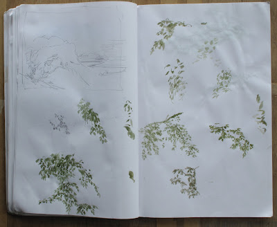
Leafy Beech Studies

watercolour in sketchbook 18”x14”

These are studies made specifically for a long Work in Progress

I’ve been Progressing on this Work on-and-off since January, but for one reason or another I haven’t been able to engage with it fully till the last couple of months. I’ve spent the whole of June grappling with it exclusively – changing elements around and gradually defining the spaces and masses. So many basic things had to be corrected from the start – the avenue spacing on the right had to be altered, as the children amongst them started off too big and had to be resized, but still be visible behind the tree trunks. The right foreground didn’t read well and had to be reworked. It was carnage…

Well, the other week I had another Little Local Difficulty to solve - differentiating the near top foliage against the treetops on the right, and my reference images weren’t helping much. I had to invent something, and had no idea how beech leaves worked, so it was a case of finding some reference materials, and drawing them.

It’s an odd thing, and I’m sure Leonardo da Vinci would agree with me, but the process of drawing is really very good for understanding how things work. Active observation forces you to analyse the subject - as in ‘How do I know that bit is round and goes behind that other thing?’ - because you know you’re going to have to recreate it.

Anyway, there I was, having to extemporise on a theme of beech tree leaves. I found some clear references and simply spent an afternoon drawing them in my sketchbook, and got enough understanding of their visual character to win that little skirmish. The sketches aren’t particularly good, but it’s more about the process than the result.

And is this month’s post a bit of padding due to my not having finished anything else his month? No, no. Not a bit of it.

No. Nope. Non. Absolument non, no. Of course not, perish the thought…

Wednesday, May 29, 2013

Cloud Studies


watercolours 16.5cm wide

Quick sky watercolours from the window. They were done on unstretched paper (200gm Bockingford if you must know) so were a bit wrinkly, and I finally got round to flattening them last week.

Four pigments used here – Ultramarine and Prussian blues, Paynes Grey, and a touch of Sepia – five if you count the Titanium White gouache. So that’s five pigments then.

It’s very fast work. Basically, I’ll have a very, very good look at the cloud forms, noting shapes, tones, and colours, and if possible understanding why they are so. Dampen the paper, whack on a blended wash of the two blues, wipe off the fuzzy altocumulus with some paper towel, take off more of the cumulus with more paper towel and a brush mop then indicate (mop brush) what the cumulus were like when you last saw them, if you can remember that far back (when the clouds were very different from how they are now, the blighters) with Paynes Grey. Make the cumulus shadows a bit more like cumulus shadows, which were a bit warmer, by adding a touch of sepia, and play around with the washes while the rapidly fading memory gets replaced by the now totally new forms in the sky. Guessing wildly, firm up with a bit of opaque white and watch as its brilliance fades to a disappointing light grey as it dries.

Wipe brow with a paper towel without blue on it, and retire for a cup of tea.

Repeat process when yet more clouds appear…

Tuesday, April 23, 2013

Landscape with Tom Mix

oil on canvas 61x51cm

Howdy partners! 

Just for a change, here’s a light-hearted piece - a quick-draw Wild West Cowboy up in the Wild Northwest of Scotland. 

I saw the image of Tom Mix as a little black and white inset in a newspaper article about the culture and myths of the American cowboy. He was the original cowboy film star, pre talkies, and was the template on which all those who came after were based. 

The landscape of the Northwest is quite unlike that of the rest of Scotland; the mountains (this is Ben Loyal as it happens) erupt out of very harsh country and if you’re VERY suggestible it has a look of ‘Arizona’ to it, but with midges. The painting is more about the landscape than anything else - the figure is really just providing an excuse, a visual McGuffin.

I had a bit of trouble with the composition of the landforms immediately behind the figure. Initially the grassy slope slid off the side of the painting, so I imported a rock outcrop to secure it. The ridge on the left originally went straight across diagonally, and again slid straight out the side, so I had to lower it and invent a right side to the valley make the forms stable. This ended up revealing a lot more of the base of the mountain, which was a bonus. The subtle colour shifts in the sky could have been very problematic, but I ended up ‘printing’ the later paint/glazes on with a dabber. This is sort of like the pads renaissance or wood-block printers used to ink their type blocks, but more low-tech and disposable. It helps in very fine tonal control and makes for a fairly even surface, with the added bonus of not leaving a residue of cat hair (see last month’s post).

Now, I have some news. I have been offered (and have accepted) a solo show at the Union Gallery, in Edinburgh, in March next year. So, compadres, if you’d like to eyeball Tom Mix (and more), then y’all and your posse set a trail to Central Edinboro, and mosey on down to the Union – more details as and when I get ’em..

Which means I have a lot of work to do

Gi-it ‘em up, an’ mo-ove ‘em out… 


Saturday, March 30, 2013

Blue Lake

oil on canvas 61x46cm

There was a little bit of serendipity involved in putting this together. 

The lake is in north-west Sweden - just west of Arjeplog along route 95. I found this view on google maps early last summer, but collected the details and finalised the composition only after seeing the figure, in September. 

She was from a photo in a newspaper article about the New Orleans flood. Her image/posture was exactly what the piece had been waiting for, and it was snipped and scanned in a matter of minutes. The sky used various photos and a live watercolour as a starting point, and developed from there. The foreground was adapted, and the red trees multiplied, from the original source, and the nearest bits of shore in the corner are from another location along the lake.

This is where the serendipity comes in. I started painting in October, and after a day or so I wanted to check something else. I found the spot again, but was horrified to find that Google Maps had re-photographed that stretch of road. It was now an overcast windy day, and completely un-usable. The timing of finding the figure and gathering the information had been crucial, though I didn’t realise it at the time. Very lucky.

I didn’t have any music lined up for this originally but when I re-started after a bit of a gap, I was listening to John Martyn’s 1977 ‘One World’ album quite a lot. The track One World began to work very well as a mood-setter, though Max Richter’s album Infra seemed fairly resonant as well.

So here’s a lake with a figure in it, and there’s a tension there. My own feeling is that this is a person who is full of despair, despite the beauty and serenity all around her. 

On a lighter note, I’d just like to point something out about the brushwork. A lot of the paint is stroked, blended, and stippled when wet – using fan, and face powder brushes, and soft mops (some of which are my shellac polishing mops from restoration days). These normally stand in a jar alongside the other brushes, and our two cats have found it increasingly pleasant to rub their necks against them. I will frequently pick one of these brushes up and find that instead of delicately manipulating the paint, I have smeared a layer of soft, fine cat hair into it. This is extremely fiddly and difficult to remove. The effect is plainly visible in the central cloud area, which is unfortunate.

They are now kept in a closed box (the brushes, that is…)


Monday, February 25, 2013

Window Work


watercolour 8-12cm tall

It’s been a year since I’ve posted figure sketches so here’s the best of the last few months’ output.

I’ve never really mentioned the brushes I use for these, so I will now. They are oriental ‘calligraphy’ brushes, which I first discovered as a student and have continued to use for drawing and general watercolour ever since. The hair bundle is long, and tapers directly from the base, providing a large paint reservoir and a wide range of marks – very handy for rapid drawing.

They come in a variety of sizes, and blends of different hair are used – pony, goat, and weasel are some I’ve come across, though the makers use many types. Prices vary depending on the skill and complexity of construction, and I tend to go for the general purpose cheaper kinds. Goat hair is extremely soft and fragile but is very responsive, weasel hair has a stiffer touch and can be a little easier to use if you’re a bit ‘off’. When you get a new brush, the business end is likely to be rigid; the makers apply a weak gum to the hair to protect it. Just swizzle the brush in some water and this will loosen and dissolve in a couple of minutes. When finished with it, preserve the point by licking it sharp - the point is the whole point after all…

Now, an interesting snippet. if you go looking for these on the Interweb, you’ll find Wolf Hair brushes. These are not actually from the Wolf (Canis lupus); their hair is more like bristle and would be more use to buff your shoes with. Wolf Hair is from the tail of the weasel. Apparently the same Chinese character is used for both wolf and weasel, but the weasel is described as the Yellow Tail Wolf (or Mouse Wolf as I originally heard it) and the mistranslation has stuck.

Finally, if you’re in Edinburgh in March, pop into the SSA Open Exhibition at the Royal Scottish Academy building – the ‘Parthenon’ on Princes Street at the Mound. It’s free, and is a selected show of the best current artwork in Scotland.

And you can see White Calf and Copse in person…

Wednesday, January 23, 2013

Sky Study


watercolour and gouache 17x11cm

I was looking out the window after New Year and I saw this late afternoon variety of cloud forms (love those mottled altocumulus) - a rarity this time of year. ‘Sunny’ Scotland still has very short dark days just now, covered by blanket stratus or dull stratocumulus.

There are some very nice soft effects in this little sketch. The gouache helps, but the main difference to previous water sketches is the paper – Bockingford. The paint lifts off it very easily, enabling soft edges without unnecessary disturbance or tearing of the surface, and it’s very, very helpful to work with – especially with this subject matter.

That’s all there is to say about this piece, really. As usual, I’m piling into other complex oil pieces, but more about them as and when they’re completed. So that’s it for now…

…except, of course, that I’ve re-formatted the blog. I’d been getting rather fed up with all the blinding white, especially as it goes against a bee I have in my bonnet concerning White Walls in Galleries*. The grey, hopefully, will be a lot kinder to the images. It’s early days yet, and I still have to do a bit of tweaking concerning links to larger images – which I think are quite important – so the peripherals may change from time to time.

The title’s changed as well. It seems to me now fairly self-evident that I am indeed doing it properly, and any back-story, if that’s what there may be, is now irrelevant.

So, as they say, New Year – New Formatting for the Blog/Blog-reader Display Interface…

*The light tones in a painting are always less light than the surface they are displayed on, and lighter colours appear duller and more lacklustre because they are drowned out by the base white of the gallery walls.