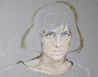

oil on cellophane
This is a cellophane correction sheet on two different backgrounds. I made it in a final attempt to get a likeness in a troublesome portrait. The clear cellophane was taped over the (dry) painting and the face safely redrawn and painted on it in oil paint, without disturbing what good stuff there was on the original surface. It’s a bit like using Photoshop layers. The cellophane is a huge improvement on using tracing paper for corrections, and for trying out and adding new elements to an established painting.
Once happy with the new likeness, I traced the face in ink lines on a new cell sheet, removed it from the painting, and pricked out the lines with a needle. I taped this pierced ‘cartoon’ (yes, that’s the technical term) back onto the painting, and lightly worked water-based gouache paint through the holes. When the cartoon was removed there was a map of the new, corrected image over the original, inaccurate work. I repainted that with oil, using the dots as guides, with the painted cell propped up nearby as a model. Any anomalous gouache dots were washed away with water. It’s actually quite simple. You can see what a difference this correction made by having a look at the ‘Works in Progress’ link to the right.
This sheet looked so fresh and alive, even though it has alignment marks all over it and was taped to a piece of cardboard, that I may get it properly framed up as a work in itself.
The really tricky bit was making the corrections. I had to make the image unfamiliar so that I wouldn’t be repeating the same old mistakes. The new image was created by studying both the painting/cell and my reference image in a mirror facing the easel, then turning round and applying the paint the right way round.
Now, that actually wasn’t simple…
